Sunday, March 4, 2012

RHYTHM

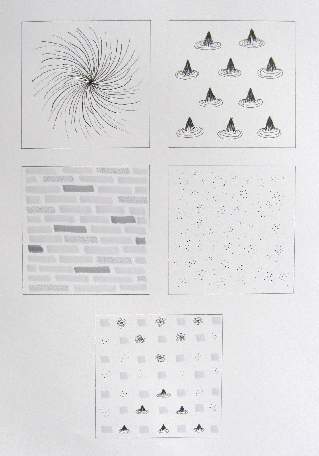
The sense I chose is taste.  The designs are for:
Sweet    Sharp
Filling    Salty
Full Meal?


Sunday, February 26, 2012

BALANCE

Kitchen Mechanics
This was fun.  What interesting shapes could I find that weren't too hard to cut out?  I started with the long, 'thin' items first, and then added 'round' items to provide some balance.  The end result seems a bit like the cogs and pulleys of a machine.


Inner Mechanics
I tried and tried to do something with all the negative space pieces, but got nowhere with the huge blocks of negative space outside the mechanical 'monster'.  The inner negative spaces easily slipped into a spare design which reminds me of a Zen garden.  Creating a bit of a curve in the line of the 'round' elements helped to balance the sharp irregular outline on the left of the large piece.


Sunday, February 19, 2012

Scale and Proportion

Emma's Loo - 2012
A semi-surreal still life


Emma's Loo with Emma - 2012
I was asked if I could create greater size difference to this "still life".  I did have a very small Emma which I had left out of the original because Emma is "live" and not "still", and I liked the arrangement without her so well.  I leave others to judge which is the better version. 


Friday, February 10, 2012

Emphasis and Focal Point

CONTRAST

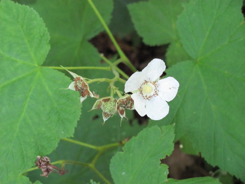
Thimbleberry, Porcupine Mountains, Michigan, 2010 - Eleanor Rice

The white color of the single open flower contrasts with the overall green of the leaves and stems, and draws attention to the full cluster of blooms in different stages. 


ISOLATION

 Climbing Rose, Springfield, VT, 2010 - Eleanor Rice

The climbing rose is the main element of color in this picture.  The blue door is isolated far to the right, but adds a second major color focus enlivening the dull brown of the house.  Between the two is the small focus of yellow flowers, creating the full image of an early summer garden.


PLACEMENT

Toadstools, Porcupine Mountains, MI, 2011 - Eleanor Rice

This cluster of orange toadstools are placed with the middle one near the center of the picture.  The middle one draws the eye, which can then travel from the smallest to the most mature toadstool in a radial line similar to the lines of two of the roots.


ONE ELEMENT

Travel Mug, Ferry Beach, ME, 2010 - Eleanor Rice

The travel mug is a large, obvious single element.  The rock next to it provides some balance, and creates a conversation between human-created and the natural.


ABSENCE OF FOCAL POINT

Rock Surface, Canyonlands, UT, 1999 - Eleanor Rice

An overall pattern of sedimentary layers on a large stretch of surface rock. 
Friday, February 3, 2012

Unity - Grid

 
The grid in this page lay-out is simple, primarily three columns of text.  The grid is modified so that the top header extends into the second column and a graphic fills the top half of the second and third columns.  Minor notations are in small fonts on the side and bottom of the page so as not to distract.  What I especially like about the page is the conversation between the text and the graphic.  The subject is Moral Health, and the graphic is non-objective, interconnected, multicolored, and seems to be extending off the page.  Whatever the text says, the lay-out suggests that Moral Health is complex and stretches beyond what is said or this moment in time.

Thursday, February 2, 2012

Unity - Figurative


My first thought of figurative unity was the Pilobolus Dance Theater.  Part of their dances involves flowing in and out of sculptures of multiple people, where the choreographer has clearly considered continuity of line.  In this particular image, the male dancers mirror each other and pull it together while the women parallel each other and flow out.  

The Dance by Henri Matisse captures so well the flowing unity of a circle of dancers.


Unity - Non-objective

World Day of Music 2010 flyer
by silva!designers

Unity is created in this flyer by several features.  All the shapes are rectilinear.  There is a predominance of red, orange and yellow, which are sometimes grouped as well.  The over all arrangement of the shapes is more clustered near the lower right hand corner and then spreading out in "rays" on various diagonals.  Variety is added by the additional colors and occasional smaller shapes turned in a different direction.