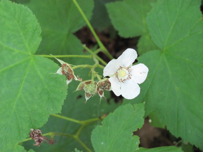
Sunday, April 29, 2012

POSTER FOR A CAUSE

What I care most about is the earth.  I am a gardener and I love the natural sounds when I'm outdoors.  I do not like the sound of gasoline lawnmowers, my neighbor's leaf blower, or the cars racing up the hill.  I myself use human power as much as I can - clean energy, free exercise, and quieter communion with the earth.

A word of gratitude to the friend who handed me a pile of colored paper to play with.

I now join the photographer in our class in frustration with the color interpretation of my digital camera.  I couldn't fully capture the light yellow background of the poster.


Sunday, April 22, 2012

COLOR

A Color Wheel 
surrounded by two Hue to Hue scales using complementary colors 
and a White to Hue Value Scale below.

Redone with better execution on the second attempt.


More fun - an online Hue Test

Monday, April 16, 2012

VALUE

Self Portrait Using Different Textures
This was more fun than I expected and came out better than I thought it would when 
I was in the midst of cutting and pasting.  Textures used were rug gripper, batik 
fabric, plaid dishtowel, outer surface of tree bark, inner surface of tree bark, a piece
of a paper wasp nest, bubble wrap, a pale towel, and black plastic floor underlay.  
especially enjoy the  way the rug gripper gave me teeth!


Sunday, April 8, 2012

SPACE AND MOTION

ILLUSION OF SPACE

In this painting by Jakob Ochtervelt, the illusion of space is created primarily by overlapping.  The woman in white and the chair both overlap the table.  The woman in white overlaps the table, the woman dressing her hair, and the servant leaving the room.  In addition, the foreground and the figures in the foreground are lighter, while the rest of the painting recedes into darkness.


In this landscape by Ray Morimura, the illusion of space is created primarily by linear perspective.  The cultivated fields mostly line up on lines that point to the hills and also angle in towards the center.  A secondary feature is the overlapping of the hills with more detail in the nearer hills, but this distance still remains rather flat.


In this roller derby photograph, the illusion of space is created primarily by exaggerated size.  The legs and feet in the foreground dwarf the figures in the distance.  A second feature is the linear perspective so that the space narrows markedly toward the center of the end of the rink.


ILLUSION OF MOTION

In this photo-montage of cheetahs (or just one) in full run, the sense of motion is created primarily by repetition of the cheetah in ever larger size and more to the right.  A second feature is the blurring of the ground which adds a sense of speed.


In this roller derby photograph, the illusion of motion is created primarily by cropping.  The forearm of the forward figure is outside the frame, and both figures are just barely within the frame.  The stretch of both figures compared to the stationary poses of all figures in the background adds to the sense of motion.


In this roller derby photograph, the illusion of motion is created primarily by blurring.  Multiple parts of different figures are blurred, as is the background.


Monday, April 2, 2012

PATTERN & TEXTURE

Fifteen samples of Pattern and Texture, and a Gray Scale

Collecting and doing grayscale scans of various textures was quite a challenge, but fun.

Here are the samples:
paper wasp nest, rug gripper, a chair cushion, batik fabric, black plastic floor underlay
    wicker basket, corduroy, bubble wrap, outside of tree bark, fabric
        pale towel, inside of tree bark, paper shreds, plaid dish towel, and garter stitch knitting


The gray scale I redid after working with several of the textures in the self portrait for the Value assignment.  The batik fabric continues to present a challenge.  How much white in a pattern overrides the darkness of the background?  The final arrangement also passed what I call the 8 foot test.  How did the grays look from 8 feet away?


Sunday, March 18, 2012

LINE

Having gotten off on the wrong foot, missing part of the assignment  plus misunder-standing what I did know, I've kept the first 7 designs I did, and attempted to complete the rest of the assignment as I was supposed to.

FEELINGS using teapot, various lines, pencil, marker, charcoal, and pastels.


VERBS using teapot, ink and brush and watercolor for the first three, 
and watercolor line for the last one.


 Blind Contour and Gesture with pencil and charcoal 
(Calm from Feelings was done as contour)


VOLUME with ink and brush, and watercolor


Sunday, March 4, 2012

RHYTHM

The sense I chose is taste.  The designs are for:
Sweet    Sharp
Filling    Salty
Full Meal?


Sunday, February 26, 2012

BALANCE

Kitchen Mechanics
This was fun.  What interesting shapes could I find that weren't too hard to cut out?  I started with the long, 'thin' items first, and then added 'round' items to provide some balance.  The end result seems a bit like the cogs and pulleys of a machine.


Inner Mechanics
I tried and tried to do something with all the negative space pieces, but got nowhere with the huge blocks of negative space outside the mechanical 'monster'.  The inner negative spaces easily slipped into a spare design which reminds me of a Zen garden.  Creating a bit of a curve in the line of the 'round' elements helped to balance the sharp irregular outline on the left of the large piece.


Sunday, February 19, 2012

Scale and Proportion

Emma's Loo - 2012
A semi-surreal still life


Emma's Loo with Emma - 2012
I was asked if I could create greater size difference to this "still life".  I did have a very small Emma which I had left out of the original because Emma is "live" and not "still", and I liked the arrangement without her so well.  I leave others to judge which is the better version. 


Friday, February 10, 2012

Emphasis and Focal Point

CONTRAST

Thimbleberry, Porcupine Mountains, Michigan, 2010 - Eleanor Rice

The white color of the single open flower contrasts with the overall green of the leaves and stems, and draws attention to the full cluster of blooms in different stages. 


ISOLATION

 Climbing Rose, Springfield, VT, 2010 - Eleanor Rice

The climbing rose is the main element of color in this picture.  The blue door is isolated far to the right, but adds a second major color focus enlivening the dull brown of the house.  Between the two is the small focus of yellow flowers, creating the full image of an early summer garden.


PLACEMENT

Toadstools, Porcupine Mountains, MI, 2011 - Eleanor Rice

This cluster of orange toadstools are placed with the middle one near the center of the picture.  The middle one draws the eye, which can then travel from the smallest to the most mature toadstool in a radial line similar to the lines of two of the roots.


ONE ELEMENT

Travel Mug, Ferry Beach, ME, 2010 - Eleanor Rice

The travel mug is a large, obvious single element.  The rock next to it provides some balance, and creates a conversation between human-created and the natural.


ABSENCE OF FOCAL POINT

Rock Surface, Canyonlands, UT, 1999 - Eleanor Rice

An overall pattern of sedimentary layers on a large stretch of surface rock. 

Friday, February 3, 2012

Unity - Grid

 
The grid in this page lay-out is simple, primarily three columns of text.  The grid is modified so that the top header extends into the second column and a graphic fills the top half of the second and third columns.  Minor notations are in small fonts on the side and bottom of the page so as not to distract.  What I especially like about the page is the conversation between the text and the graphic.  The subject is Moral Health, and the graphic is non-objective, interconnected, multicolored, and seems to be extending off the page.  Whatever the text says, the lay-out suggests that Moral Health is complex and stretches beyond what is said or this moment in time.

Thursday, February 2, 2012

Unity - Figurative


My first thought of figurative unity was the Pilobolus Dance Theater.  Part of their dances involves flowing in and out of sculptures of multiple people, where the choreographer has clearly considered continuity of line.  In this particular image, the male dancers mirror each other and pull it together while the women parallel each other and flow out.  

The Dance by Henri Matisse captures so well the flowing unity of a circle of dancers.


Unity - Non-objective

World Day of Music 2010 flyer
by silva!designers

Unity is created in this flyer by several features.  All the shapes are rectilinear.  There is a predominance of red, orange and yellow, which are sometimes grouped as well.  The over all arrangement of the shapes is more clustered near the lower right hand corner and then spreading out in "rays" on various diagonals.  Variety is added by the additional colors and occasional smaller shapes turned in a different direction. 

Unity - Chaotic

Hellhound Rodeo by Aaron Johnson

This painting fits its name.  There is no easily discernible pattern.  Each element feeds and overlays other elements.  There are hints of repetition but nothing that creates a pattern.  I do recognize the various elements as similar to various demons in Buddhist art, so my overall impression is that here is the chaos wrought by the demons of our lives. 

Unity - Continuation


The local Rite Aid in Springfield VT caught my eye for the unity and continuity of the design of its facade.  The entire facade is made of horizontal and vertical lines, and all lines are repeated.  Although not very visible in my picture, the siding of the facade under the windows is also horizontal.  The font used for "Rite Aid" is a very straight-line font adding to the unity of lines.  The only break in the straight line emphasis is the font used for "Pharmacy".

I love this sign for a local business.  Unity comes in part from the close proximity of the letters, but is enhanced by the continuation of the layering of the letters.  The continuation of the layering allows the names to become a seamless unity.

Unity - Repetition with Variety

 The central image of this Tricycle cover is the very peaceful face of a woman illustrating the "Still Point" theme of the magazine.  Repeating the woman's face as both peaceful as well as one calm and one happy expands the image of the Still Point.  It's not just when we are at rest, but is present when we are more active.  It is not just about being peaceful, but about being calm and happy. 

In contrast, the repetition of hands and feet in An Tsherin Sherpa's painting is more jumbled and complex.  Specific hands and feet are repeated, but only once.  At first you don't even see that it overlays a stylized head of the Buddha.  This varied repetition makes me think of "monkey mind" and confusion.

Untitled by An Tsherin Sherpa
(card insert from Tricycle)

Unity - Repetition with Similarity


This M. C. Escher woodcut of swans repeats the same shape in two different colors, but then puts them in an endless loop pattern that suggests the movement of swans and which keeps pulling them back together again.  The fact that the pattern is the symbol used for infinity makes me wonder what Escher was thinking.  Does repetition lead to infinity?

Unity - Proximity

Proximity pulls a still life together.  In this painting by Louise Moillon (1630), the three dishes are grouped together.  In addition, each dish is full of fruit adding additional images of proximity, and the berries on the table top are also grouped together. 

In this photo from the magazine, Tricycle, the proximity of the hands focuses the attention, creating a visual image of human unity.